JonnyPops Website Redesign
Role: Creative Director + Copy Strategy
Project Type: Website Redesign
The Before:
The After:
The Problem
JonnyPops calls its products magical. The website didn't agree. A legacy Squarespace template that had never been refreshed- outdated imagery, broken SEO, inaccurate information, no life. For a brand built on joy and wonder, the digital front door was a dead end. We had 2.5 months to fix it.
The Approach
Two tracks, running simultaneously. The comms team audited every page for accuracy and priority. Design overhaul started the same day. We moved to WordPress, partnered with a build agency, and spent dozens of working sessions getting every detail right- I directed and supplied all creative assets, they built.
The Creative Decisions
The two biggest decisions shaped everything else.
The first was copy. We were building and re defining the voice and tone of the brand in real time, which meant the website wasn't just getting written, it was helping define how JonnyPops speaks. We went back and forth relentlessly, polishing and trying again, until every line earned its place.
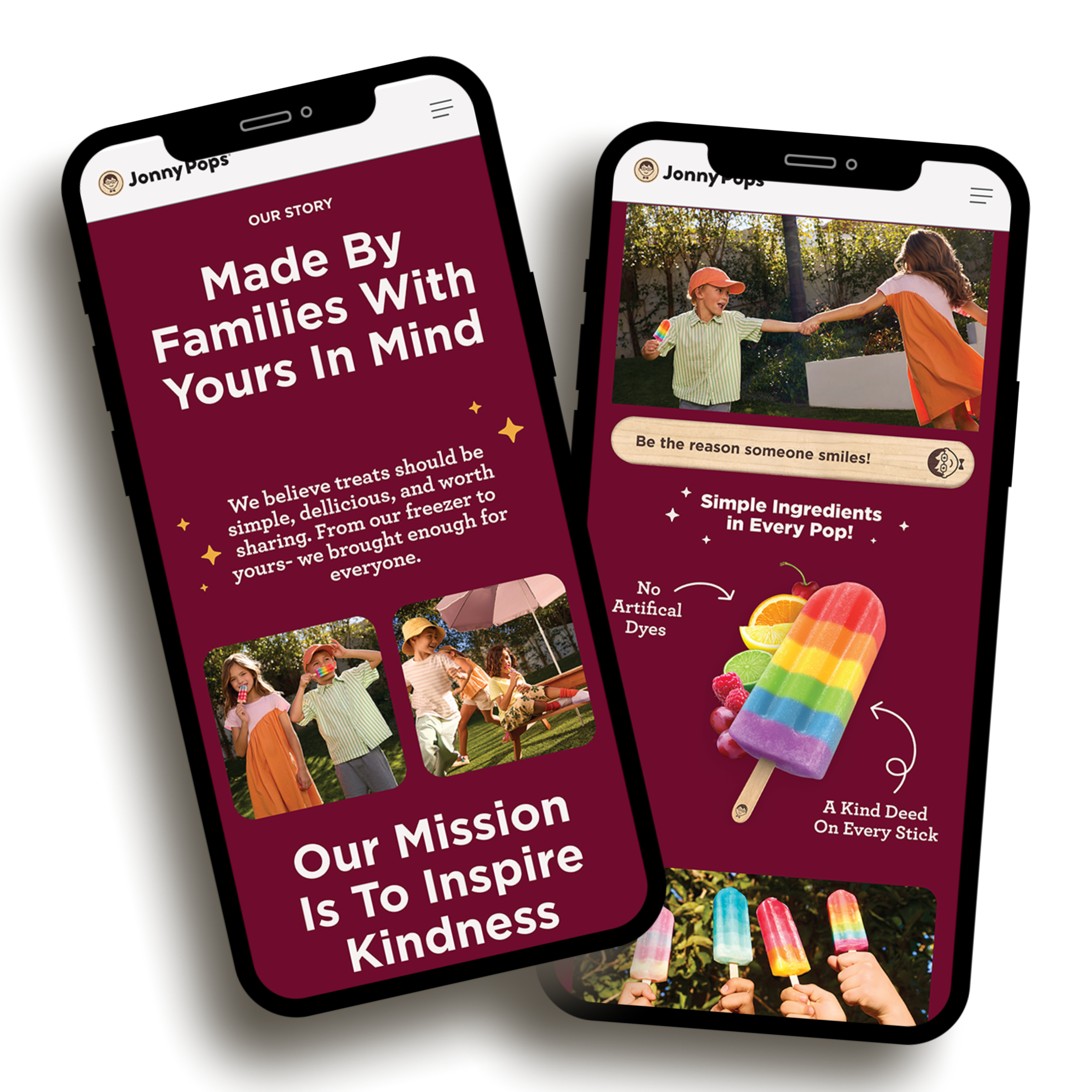
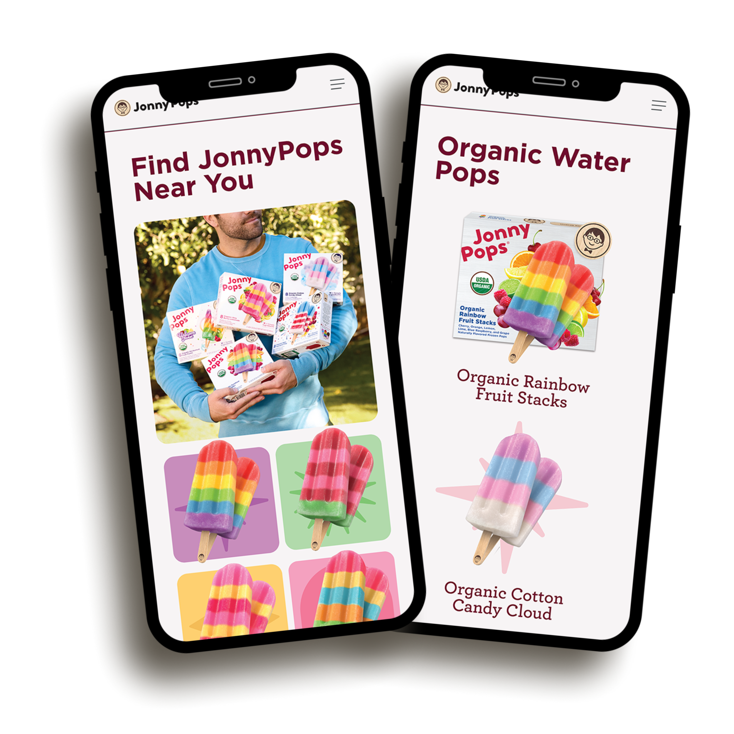
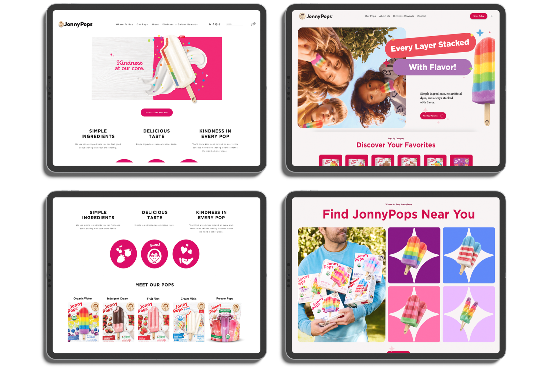
The second was visual hierarchy. The goal was to let the design do the talking, our new brand colors, the 3D product renderings, the packaging refresh. We worked incredibly hard to perfect, the photography and all the new graphic elements, all of it working together so that the story was clear from the beginning.
The site needed to feel right. That was the bar, and we didn't stop until it did.
The Outcome
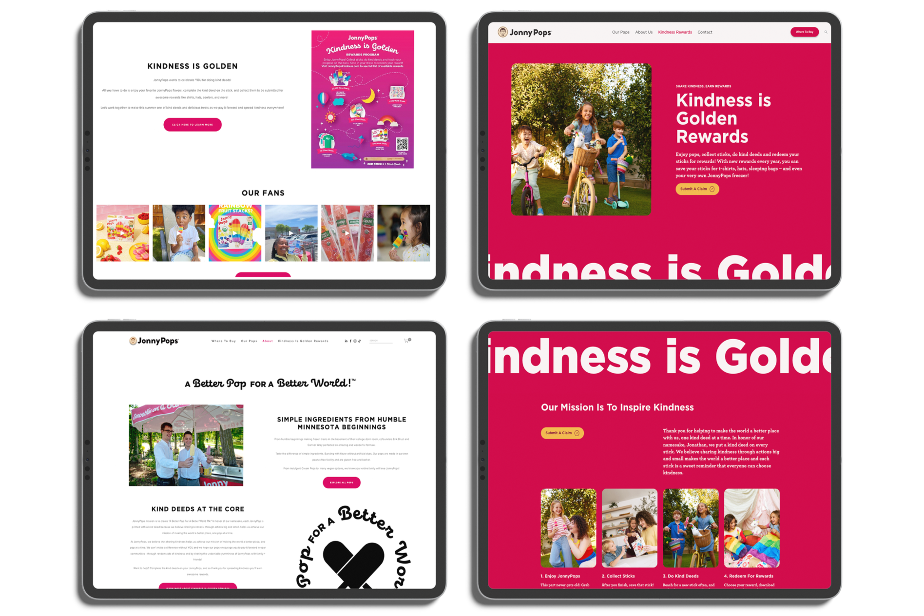
The new site brought JonnyPops' digital presence in line with the brand it had grown into, full of color, movement, and personality. Traffic increased. But the most meaningful result came from the Kindness is Golden page, where we completely rethought how we communicated our stick redemption program. The redesigned page made the process so clear that customer service saw a dramatic drop in inbound calls and emails from people asking how it works.