JonnyPops PackBrand Revival
Role: Creative Direction, Art Direction, Design Management
Project Type: Packaging Design, System Design, Press Production
The Problem
Three weeks into my role as Art and Design Manager, the Creative Director was let go. The packaging refresh- already months behind- landed squarely on my desk. The team was burnt out. Stakeholders were frustrated. The project had a logo mark, locked typefaces, and a rough sense of the front-of-pack layout. Everything else- color, illustration, fruit cues, copy, voice, back-of-pack, and the production system to hold it all together, was still undecided.
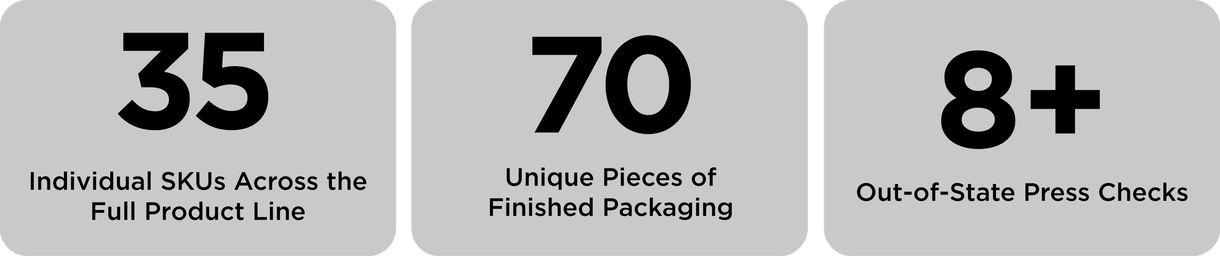
Thirty-five SKUs. Close to seventy individual pieces of packaging. No creative lead, and a deadline that wasn't going anywhere.
The Approach
I stepped into the Creative Director seat and built a working structure around what we had. I directed a team of three outside designers (none of them employed by JonnyPops) alongside a separate team of 3D renderers, while serving as the sole in-house creative on the project.
I rightsized the workflow, reset expectations with stakeholders, and closed the gap on a project that had been losing ground for months. I worked directly with the CMO, CEO and VP of marketing to get alignment on pop renderings and fruit cues, copy, and final decisions. The visual details that make or break a frozen novelty package at shelf. That meant a lot of rounds, a lot of conversations, and knowing which hills were worth standing on.
The Creative Decisions
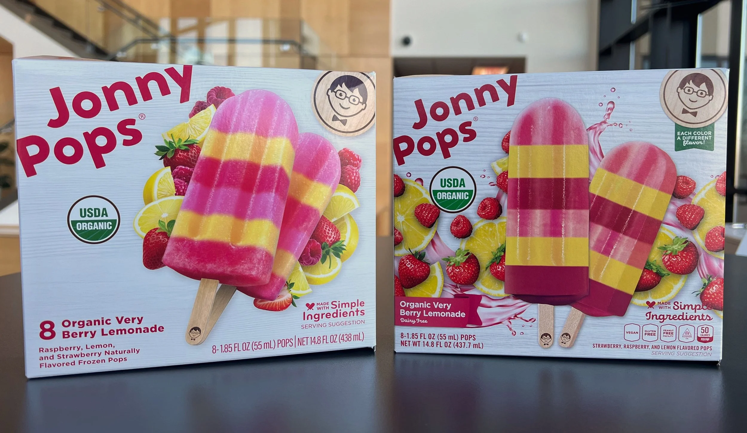
With the logo and typefaces refreshed and decided, the system had to be built around them. Every surface of every package was designed intentionally, not an inch was left unaddressed. I treated the front-of-pack as a merchandising tool and the side panels as an extension of brand voice, working cross-functionally with legal and operations to make sure every package met strict regulatory requirements without losing personality in the process.
Copy and voice required more stakeholder rounds than almost anything else. Getting legal, marketing, and leadership aligned on language- across 35 SKUs, is its own creative challenge. We forged ahead with the concrete decision to build a consistent system. We wanted to own the white blocking, and create a gallery full of the best looking product.
The Outcome
Eight-plus trips to the press floor (multiple days each, out of state) to dial in color, registration, and finish across every SKU. What came back was a cohesive, retail-ready system built to hold up in freezer cases nationwide.
This was the hardest project I've worked on. It's also the one I'm most proud of.